CSS Fundamentals: Grid Layout (Part 1)
Intro: ✍️ Welcome to the grid layout chapter. This post covers the fundamentals of grid layout.
Long time no see. The weekly post is a bit late this time — busy week, haha. OK, let's go.
1. Meet CSS Grid layout
CSS Grid is a two-dimensional grid-based layout system, which is what sets it apart from one-dimensional Flexbox. In real-world web layout, using both together makes development faster and easier.
This post walks through the fundamentals of the magical Grid layout.
2. Basic Grid layout
Most browsers ship Grid these days, and the IE era is behind us — we can use it without worrying.
First, set display: grid on the container. Use grid-template-columns and grid-template-rows to size the columns and rows, then grid-column and grid-row to place children inside the grid. The result is pretty magical.
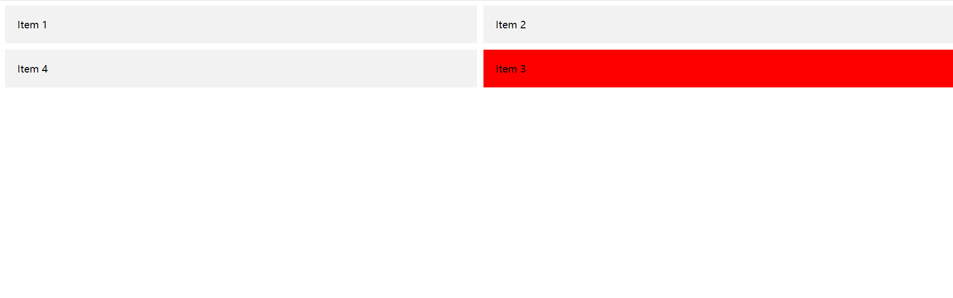
Snippet:
CSS
.grid-container {
  display: grid;
  grid-template-columns: 50% 50%;
  grid-template-rows: auto;
  grid-gap: 10px;
}

.item {
  background-color: #f2f2f2;
  padding: 20px;
}

.item:nth-child(3) {
  grid-column: 2; /* the third item sits in the second column */
  grid-row: 2; /* the third item sits in the second row */
  background-color: red;
}
HTML
<div class="grid-container">
  <div class="item">Item 1</div>
  <div class="item">Item 2</div>
  <div class="item">Item 3</div>
  <div class="item">Item 4</div>
</div>
3. Important CSS Grid terminology
Before diving deeper, the terminology matters. The terms here are conceptually similar, so they're easy to mix up if you don't pin down what each one means in the spec. Don't worry — there aren't many.
Grid Container
- The box you apply
gridlayout to is the correspondingGrid Container.
<div class="grid-container">
  <div class="item">Item 1</div>
  <div class="item">Item 2</div>
  <div class="item">Item 3</div>
  <div class="item">Item 4</div>
</div>
Grid Item
- As the name says: direct children of the
Grid ContainerareGrid Items. Grandchildren don't count.
<div class="grid-container">
  <div class="item">Item 1</div>
  <div class="item">Item 2</div>
  <div class="item">
    <span class="sub-item"></span>
  </div>
</div>
Grid Line
Grid Linesare the dividers that make up the grid structure. They can be column lines or row lines.
Grid Cell
- A
Grid Cellis the space between two adjacent row lines and two adjacent column lines.

Grid Track
- The space between two adjacent grid lines. Think of it as a column or row of the grid. The image shows the track between the second and third row lines.

Grid Area
- A grid area is made up of any number of grid cells. Here, the area sits between row lines 1 and 3 and column lines 1 and 3. Compared to a
Track, it goes from1D to 2D.

4. Wrap-up
Stopping here for now. Grid is a bit more complex than flex, so I'll split this into two posts.
Tomorrow's the weekend — time to slack off <・)))><<~. Have a good one~