CSS Fundamentals: Flex Layout
Intro: ✍️ Welcome to the flex layout chapter. I'll walk through the relevant flex layout knowledge with code.
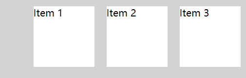
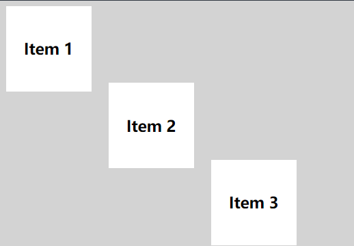
1. justify-content
The first property worth covering is justify-content.
It accepts these values:
flex-start: items align to the left edge of the container.flex-end: items align to the right edge of the container.center: items center horizontally inside the container.space-between: equal space between items.space-around: equal space around each item.
Example: justify-content: flex-end; pushes the boxes to the right.
Full code: https://code.juejin.cn/pen/7263779109577162806
Snippet:
.flex-container {
display: flex;
justify-content: flex-end;
height: 300px;
background-color: lightgray;
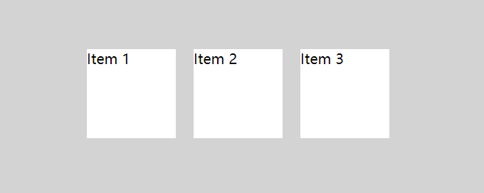
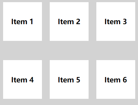
}2. align-items
align-items handles vertical alignment. Accepted values:
flex-start: items align to the top of the container.flex-end: items align to the bottom of the container.center: items center vertically.baseline: items align to the container's baseline.stretch: items stretch to fill the container.
Example: align-items: center; centers the boxes vertically.
Full code: https://code.juejin.cn/pen/7263827107703160889
Snippet:
.flex-container {
  display: flex;
  justify-content: center;
  align-items: center;
  height: 300px;
  background-color: lightgray;
}
3. flex-direction
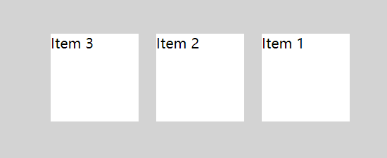
When you need to change which way the boxes flow, reach for flex-direction. This CSS property defines the direction items are laid out inside the container, and it accepts:
row: items flow in the same direction as text.row-reverse: items flow opposite to text direction.column: items flow top to bottom.column-reverse: items flow bottom to top.
Example: flex-direction: row-reverse; flips the horizontal order — 1 2 3 => 3 2 1.
Full code: https://code.juejin.cn/pen/7263830463750832168
Snippet:
.flex-container {
  display: flex;
  justify-content: center;
  align-items: center;
  flex-direction: row-reverse;
  height: 300px;
  background-color: lightgray;
}
If you've got a handle on the cases above, you can already solve most layout problems you'll run into.
That said, flex layout has more to offer.
Let's keep going.
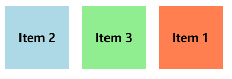
4. order
Sometimes flipping the row or column direction isn't enough. In that case, set the order property on individual items. The default is 0, but you can set positive or negative values.
Use order to rearrange the boxes.
Full code: https://code.juejin.cn/pen/7263840746686382117
Snippet:
.item-1 {
  order: 3;
  background-color: coral;
}

.item-2 {
  order: 1;
  background-color: lightblue;
}

.item-3 {
  order: 2;
  background-color: lightgreen;
}
5. align-self
Another property for controlling individual items is align-self. It takes the same values as align-items.
Full code: https://code.juejin.cn/pen/7263843761036197947
Snippet:
.item-1 {
  align-self: flex-start;
}

.item-2 {
  align-self: center;
}

.item-3 {
  align-self: flex-end;
}
6. flex-wrap
flex-wrap is a CSS property that controls whether items wrap onto a new line when they overflow the container.
Accepted values:
nowrap: everything stays on one line.wrap: items wrap onto multiple lines as needed.wrap-reverse: items wrap onto multiple lines in reverse order.
Set a width and use wrap so the boxes break onto a new line.
Full code: https://code.juejin.cn/pen/7264048063219269693
Snippet:
.flex-container {
  display: flex;
  flex-wrap: wrap;
  width: 400px;
  height: 300px;
  background-color: lightgray;
}Note: flex-direction and flex-wrap are often used together, so there's a shorthand: flex-flow. It takes both values, separated by a space.
Example: flex-flow: row wrap sets the row direction and enables wrapping in one go.
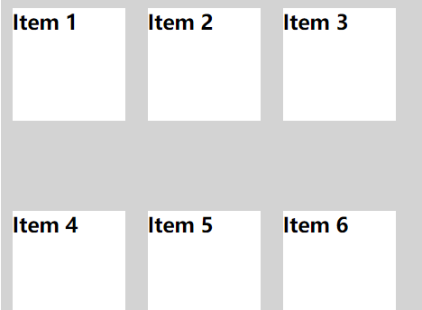
7. align-content
Use align-content to control the spacing between rows. Accepted values:
flex-start: rows pack toward the top.flex-end: rows pack toward the bottom.center: rows center vertically.space-between: equal space between rows.space-around: equal space around each row.stretch: rows stretch to fill the container.
Wrap the items, then set align-content: space-between. Note that this has no effect when there's only one row.
Full code: https://code.juejin.cn/pen/7264052555368366116
Snippet:
.flex-container {
  display: flex;
  width: 400px;
  flex-wrap: wrap;
  align-content: space-between;
  height: 300px;
  background-color: lightgray;
}
Wrap-up
A quick recap of the flex layout properties we covered:
justify-content: alignment along the main axis (horizontal) of the flex container.align-items: alignment along the cross axis (vertical) of the flex container.flex-direction: the direction items flow in.order: rearrange individual items.align-self: cross-axis alignment for a single item.flex-wrap: how items wrap onto multiple lines.flex-flow: shorthand forflex-direction+flex-wrap.align-content: cross-axis alignment for multiple rows.